
*Self-initiated work created to demonstrate design thinking and capability. It is not client-commissioned, and any referenced brands are used solely for exploration and are not affiliated.
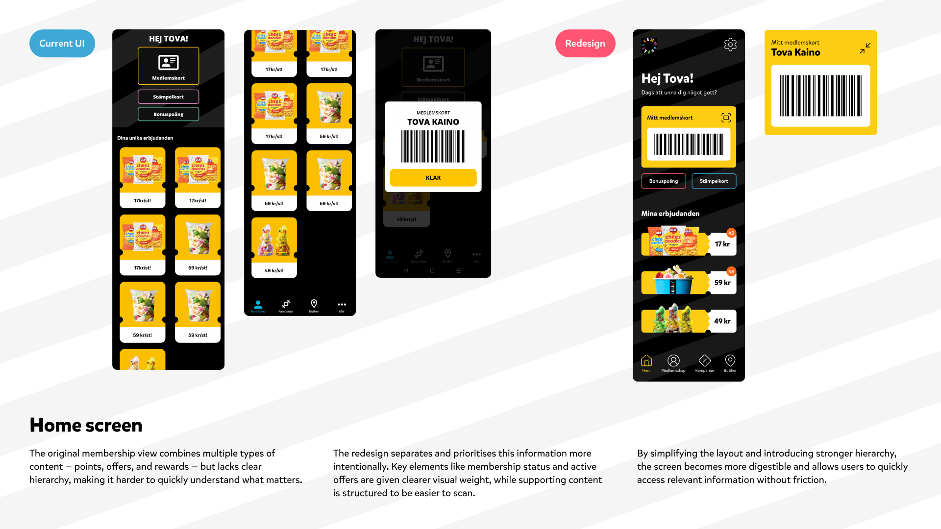
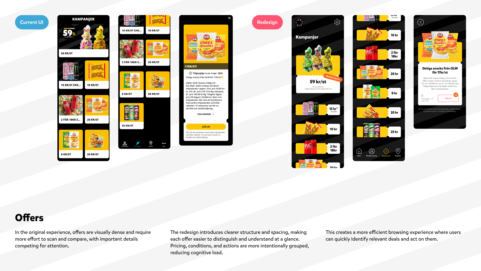
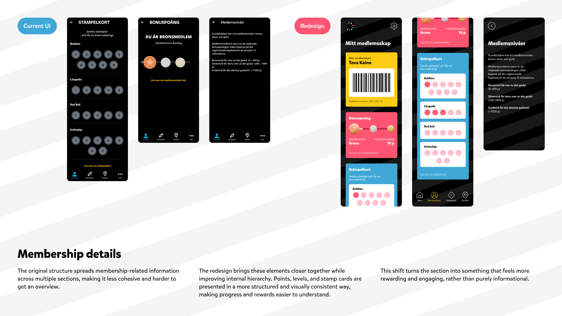
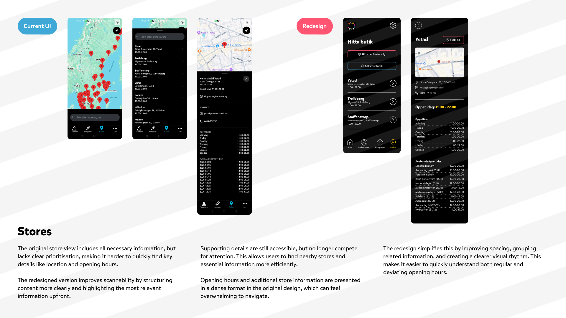
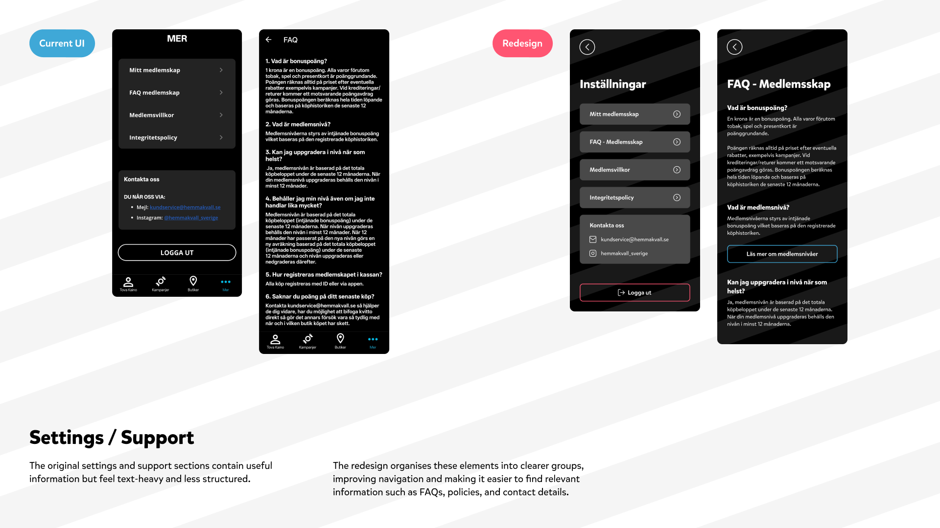
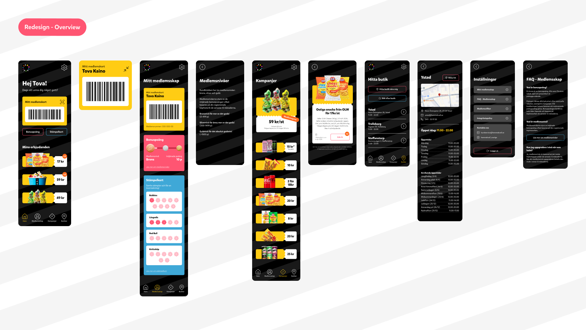
The Hemmakväll app was redesigned with a focus on improving structure, legibility, and overall ease of use. Instead of rethinking the experience entirely, the project builds on what’s already there — refining flows, reorganising content, and creating a more intuitive and cohesive journey.
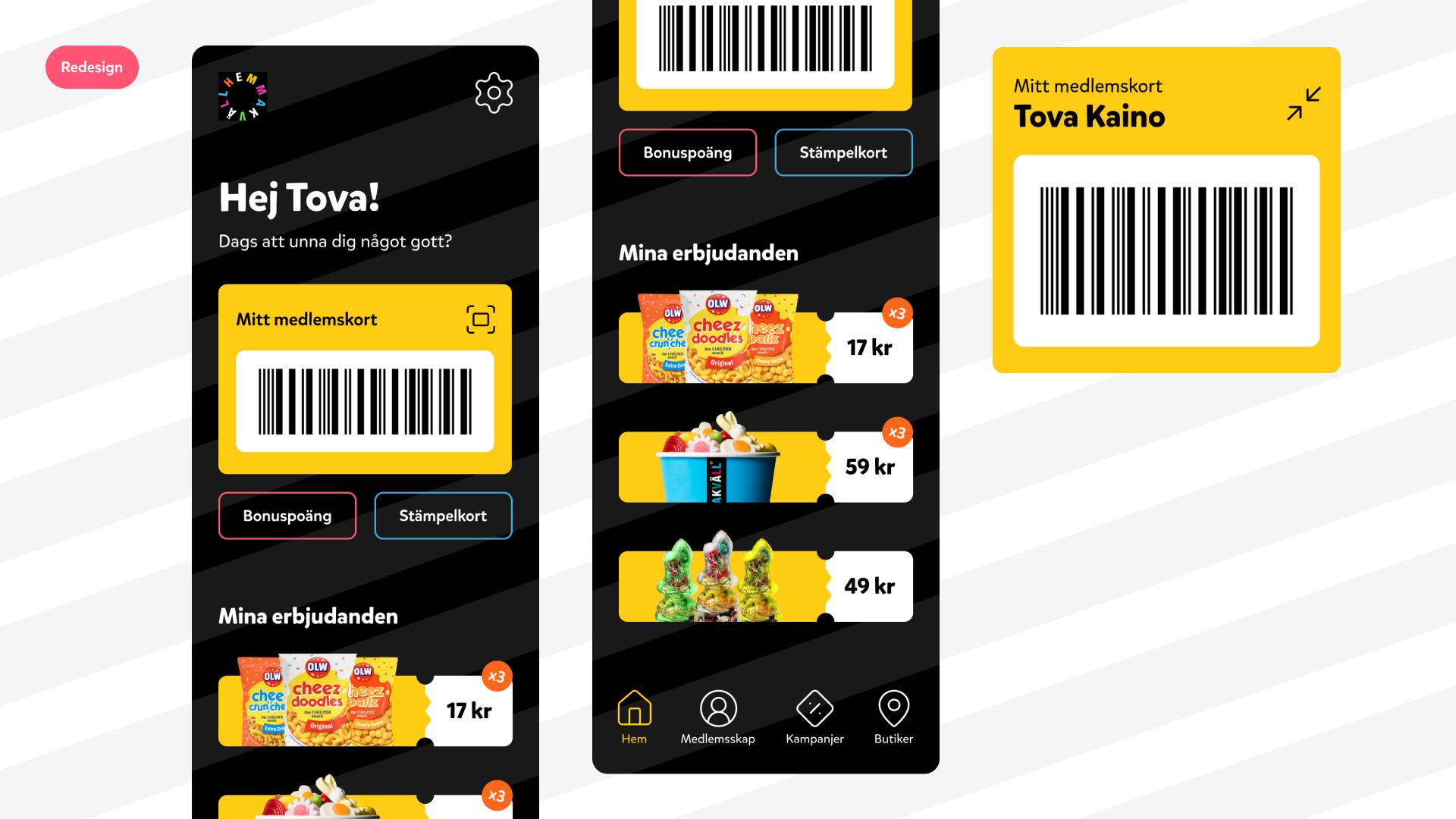
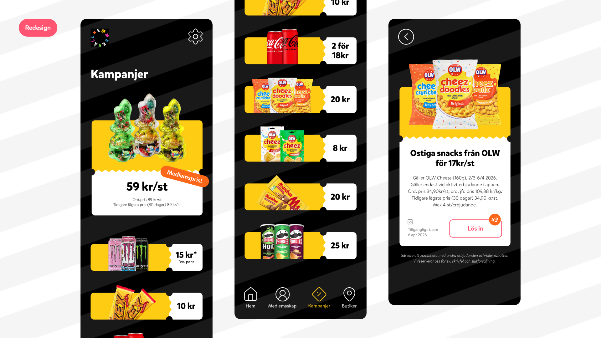
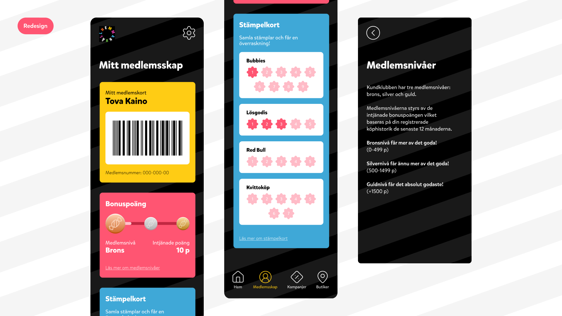
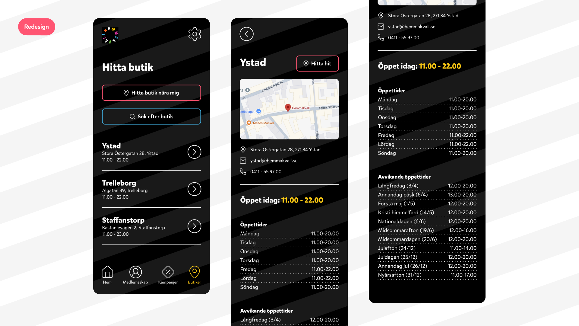
While the app offers a range of useful features, the way information is structured can make it harder to quickly navigate and understand. This redesign focuses on simplifying that experience by consolidating content, reducing unnecessary steps, and strengthening visual hierarchy. The result is a flow that feels more natural, where users can scan, browse, and make decisions with less effort.
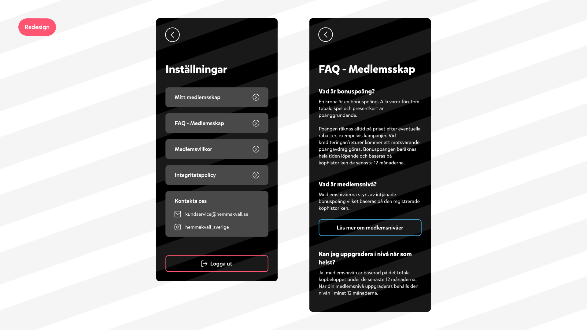
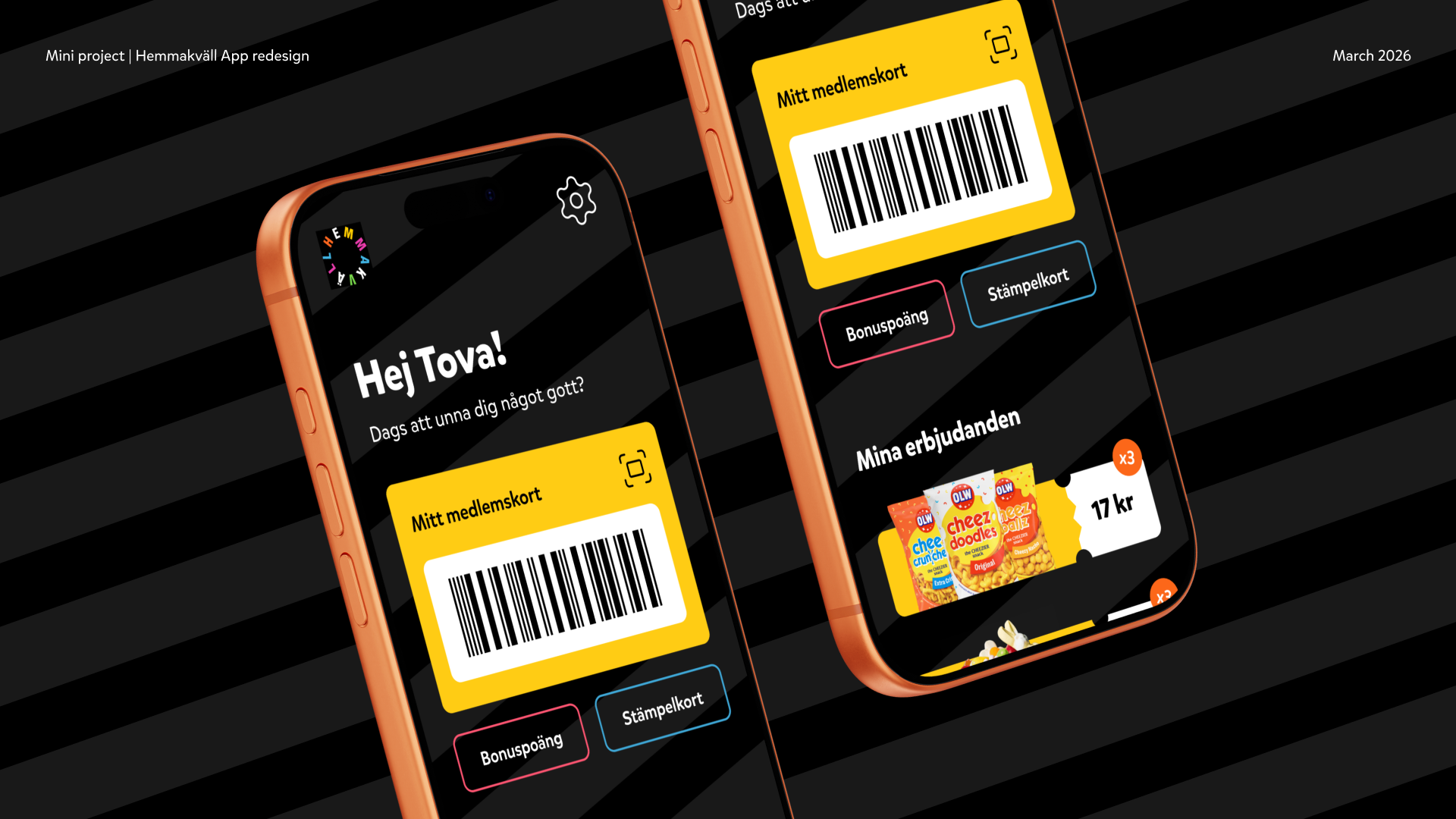
At the same time, the visual direction leans further into Hemmakväll’s playful identity. Through bolder use of colour and contrast, the interface becomes more expressive and engaging — without compromising clarity. The outcome is a more balanced experience that feels both easier to use and more aligned with the brand.