
*Self-initiated work created to demonstrate design thinking and capability. It is not client-commissioned, and any referenced brands are used solely for exploration and are not affiliated.
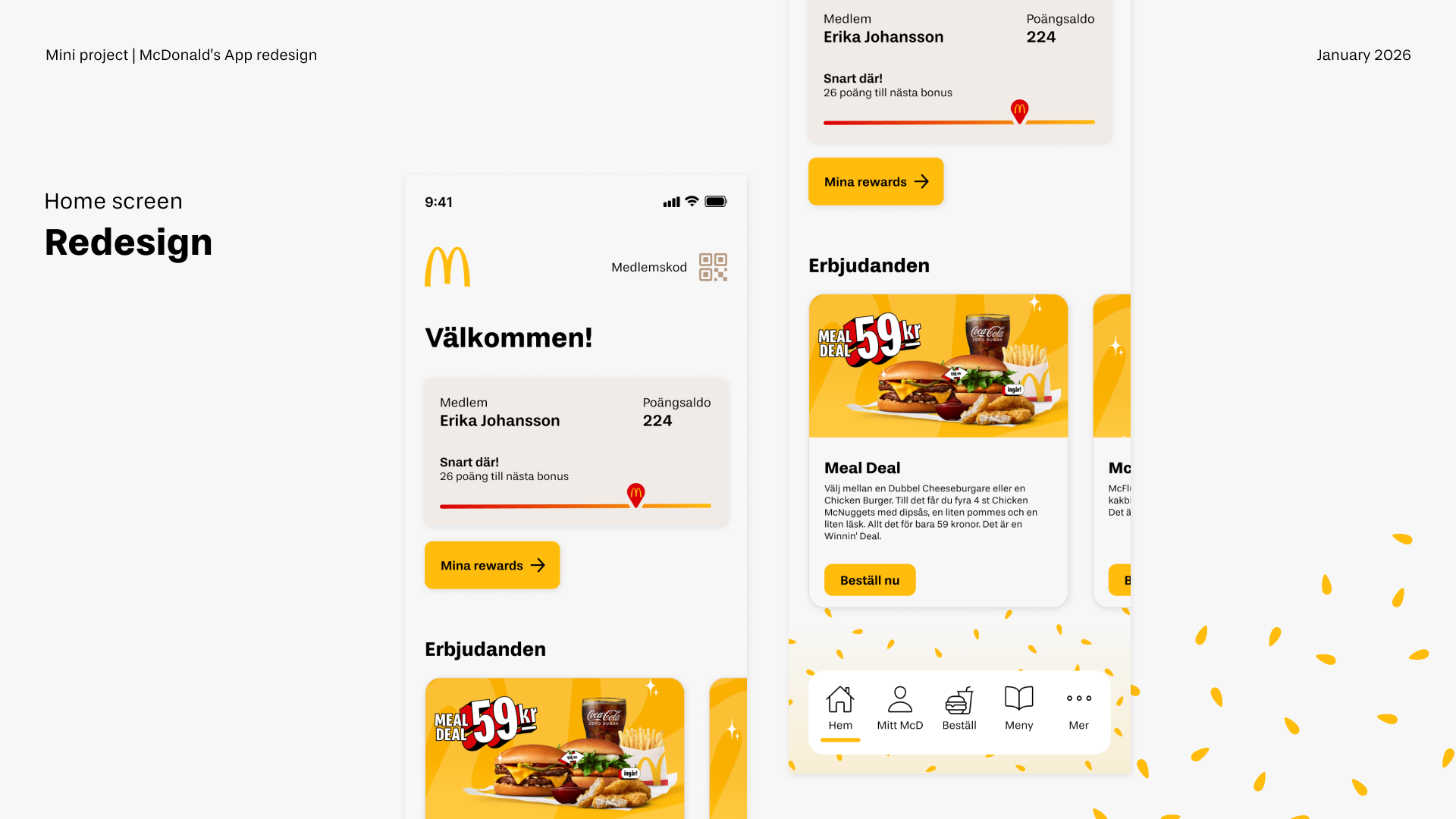
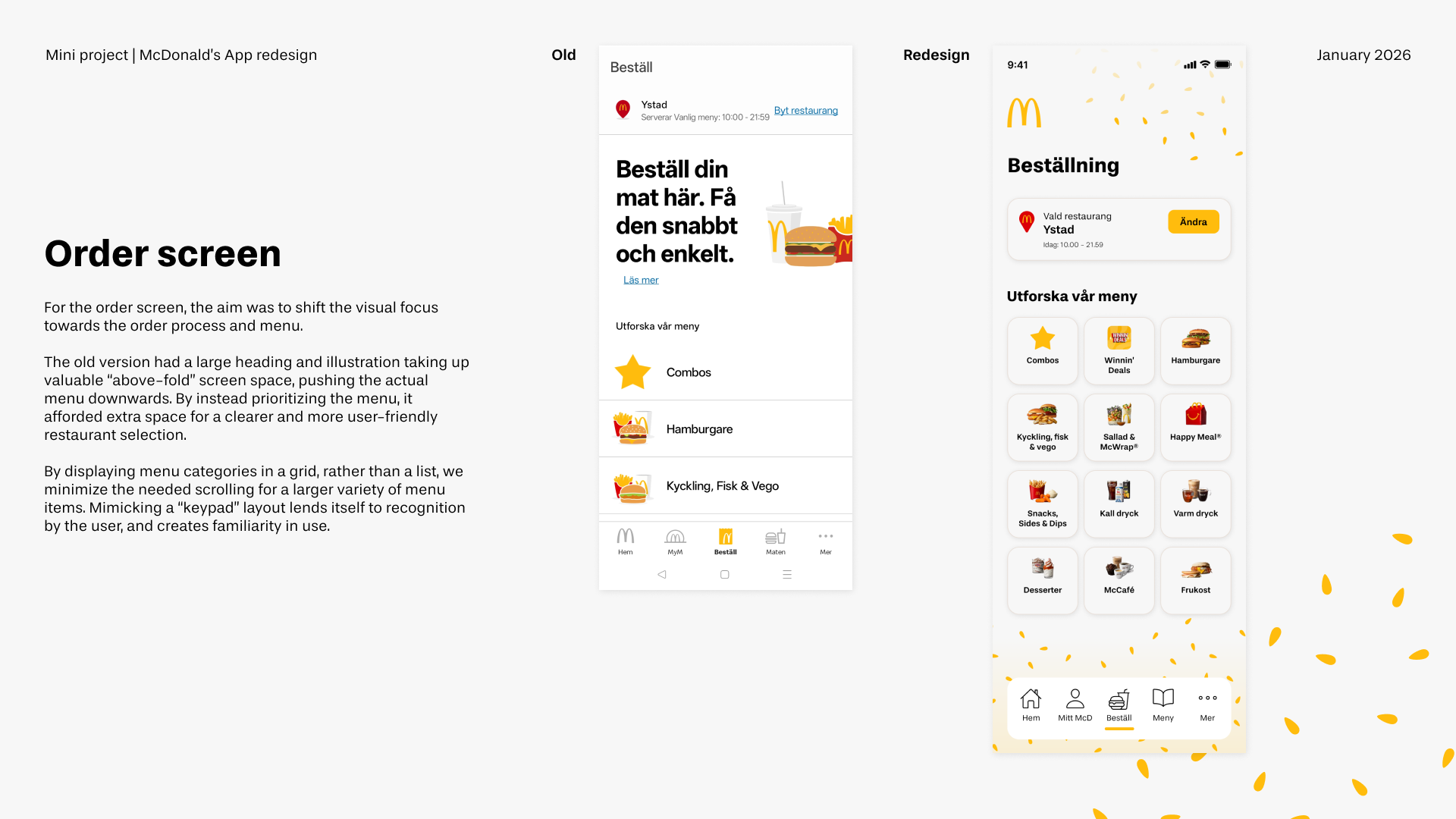
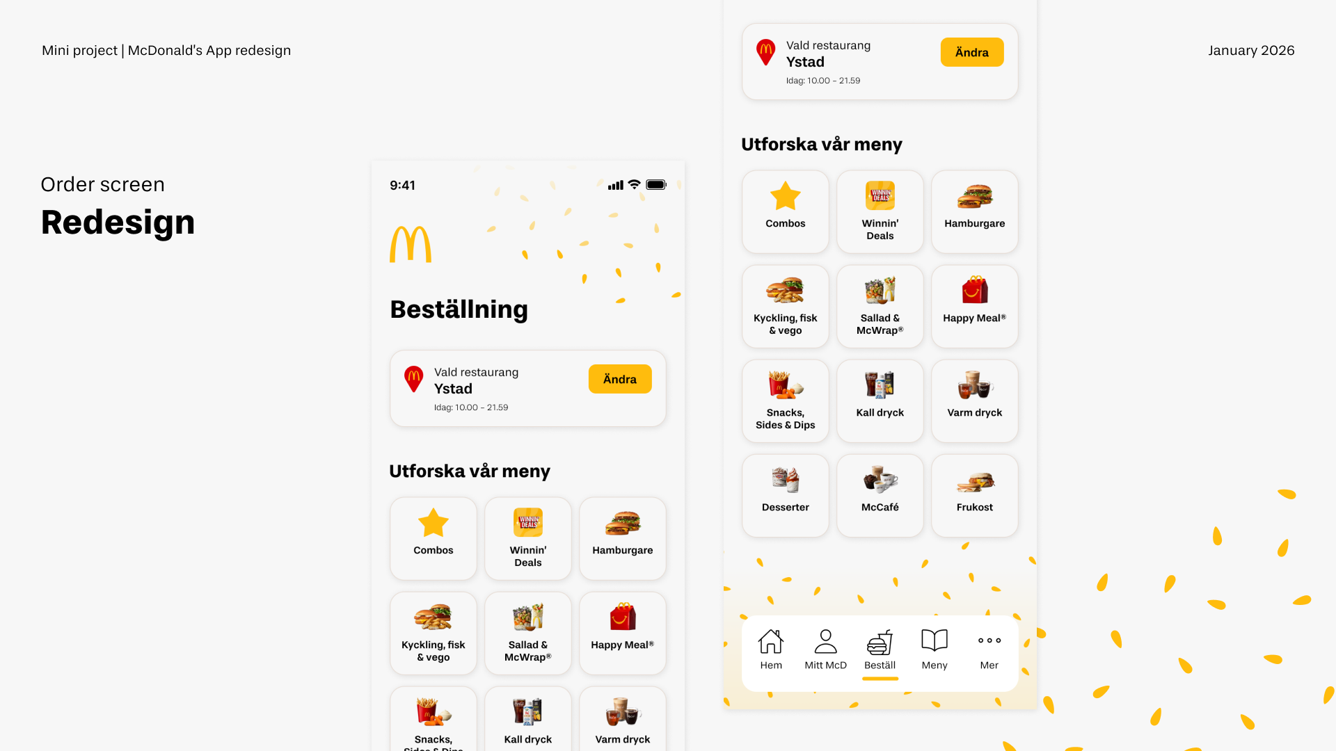
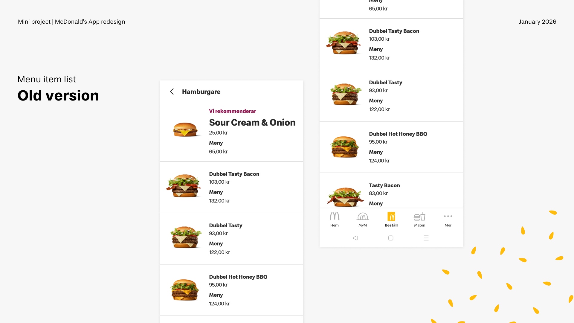
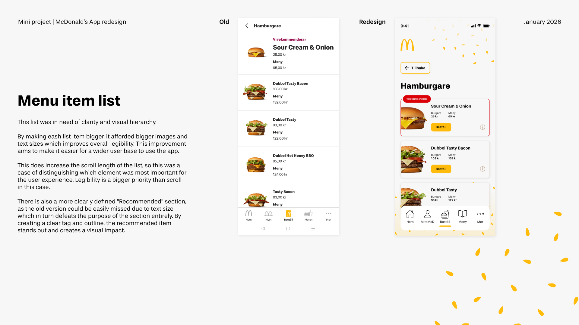
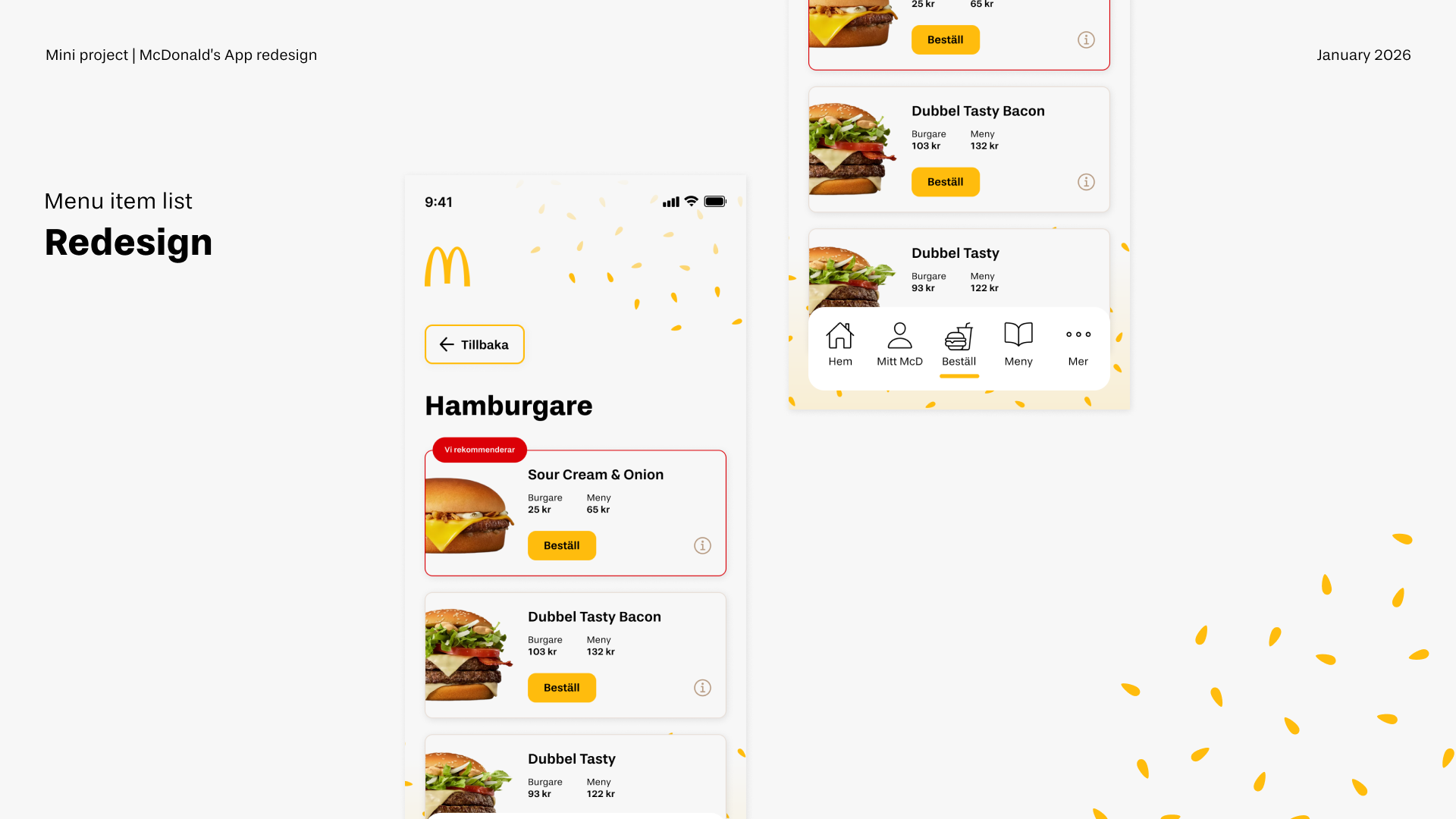
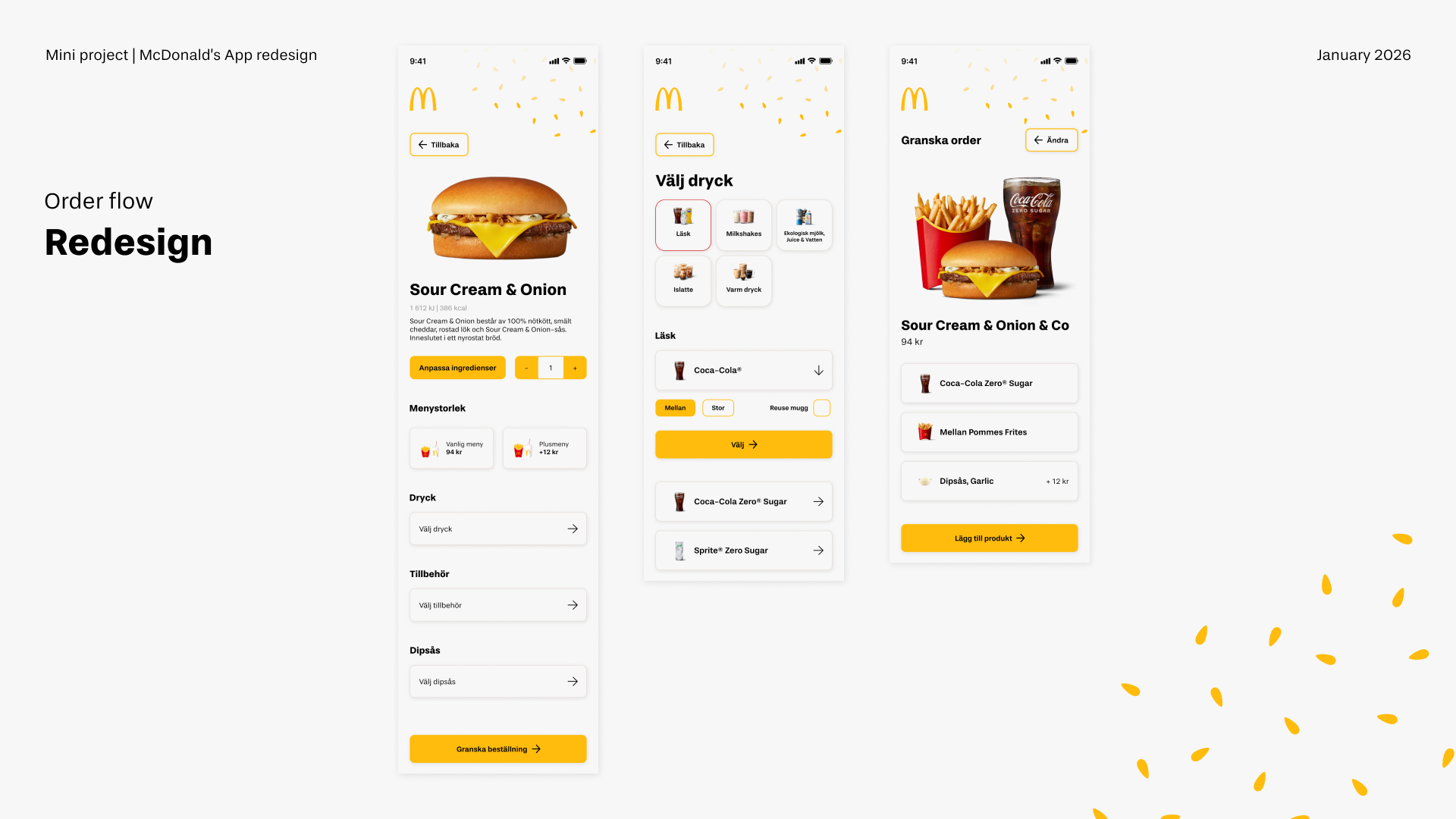
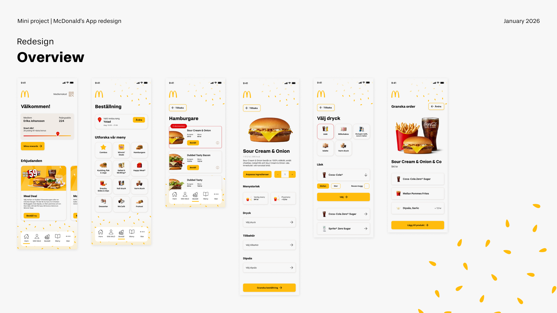
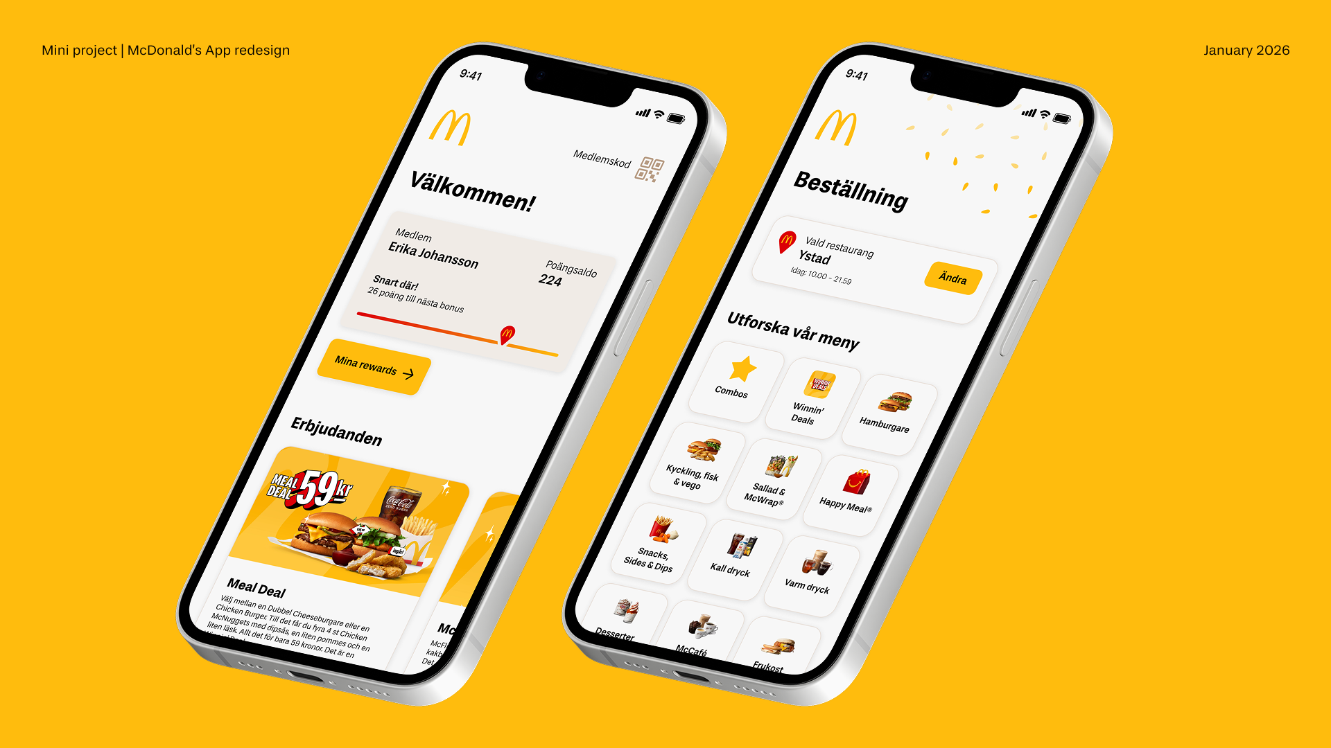
This self-initiated project explores a UX improvement and UI refresh of the McDonald’s mobile app, with a focus on clarity, hierarchy, and ease of use. Rather than reimagining the experience from scratch, the redesign refines existing flows to reduce friction and unnecessary complexity.
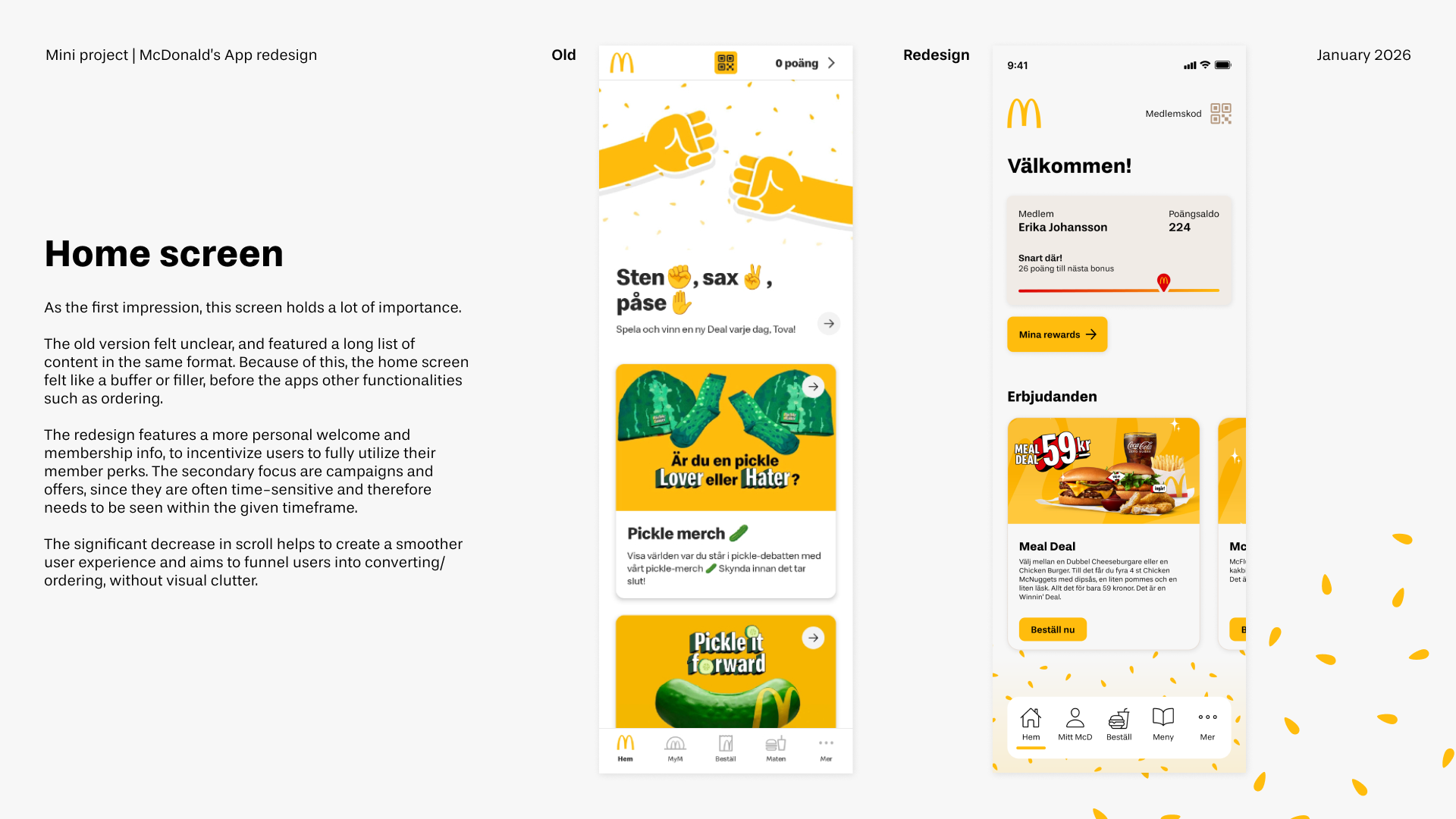
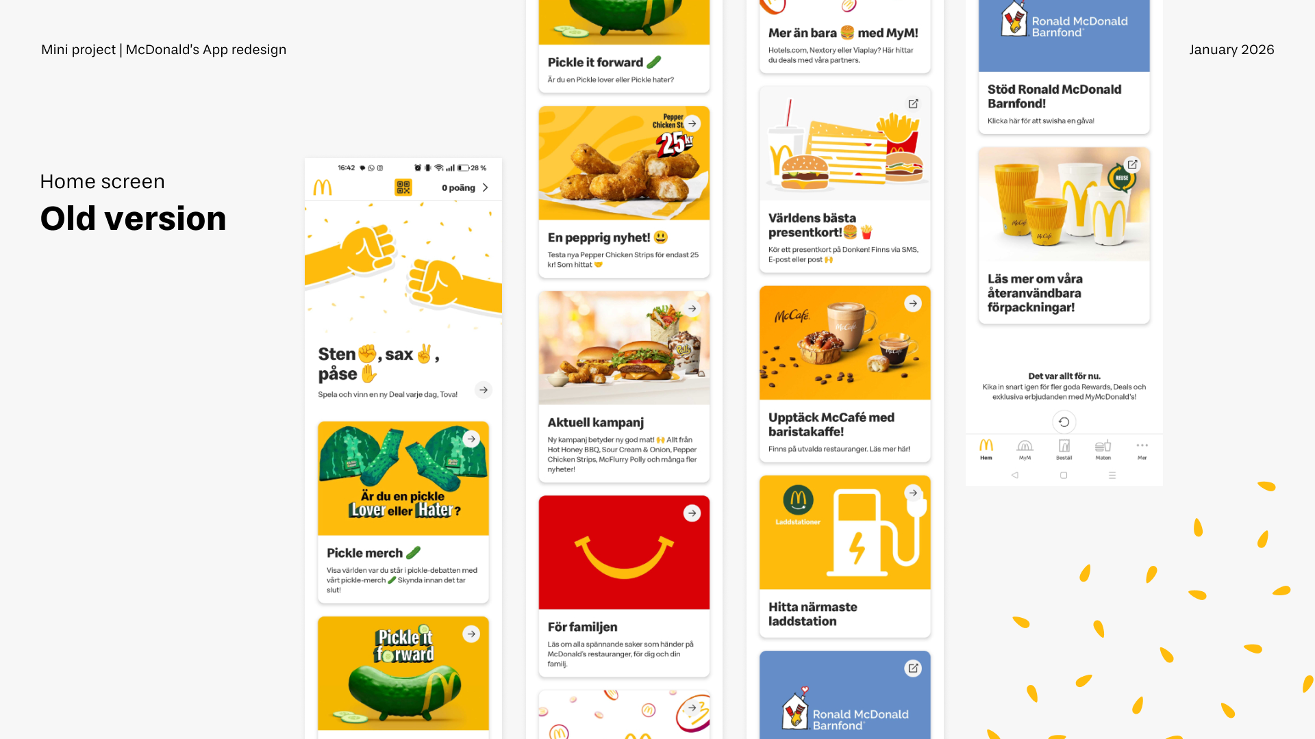
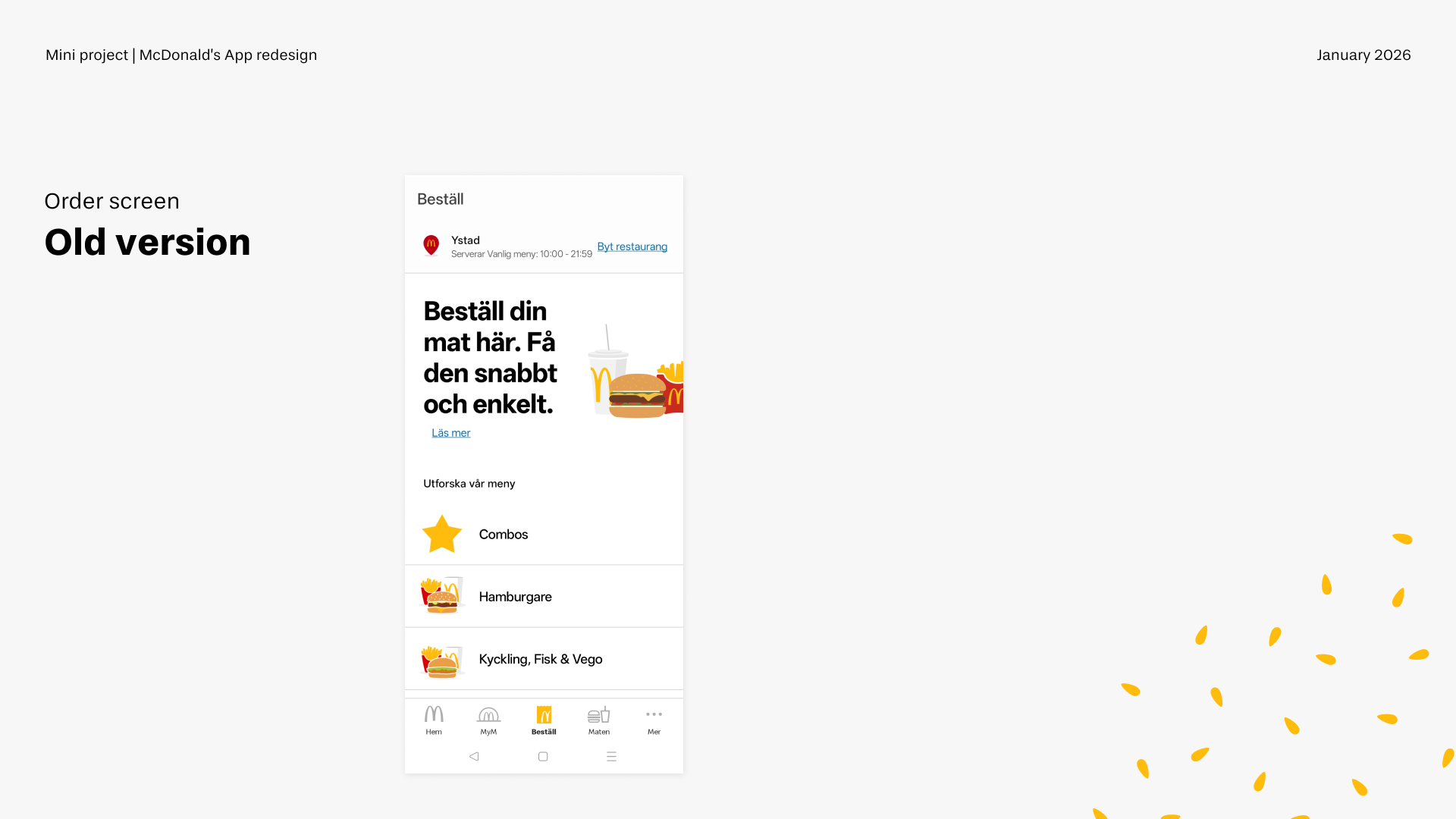
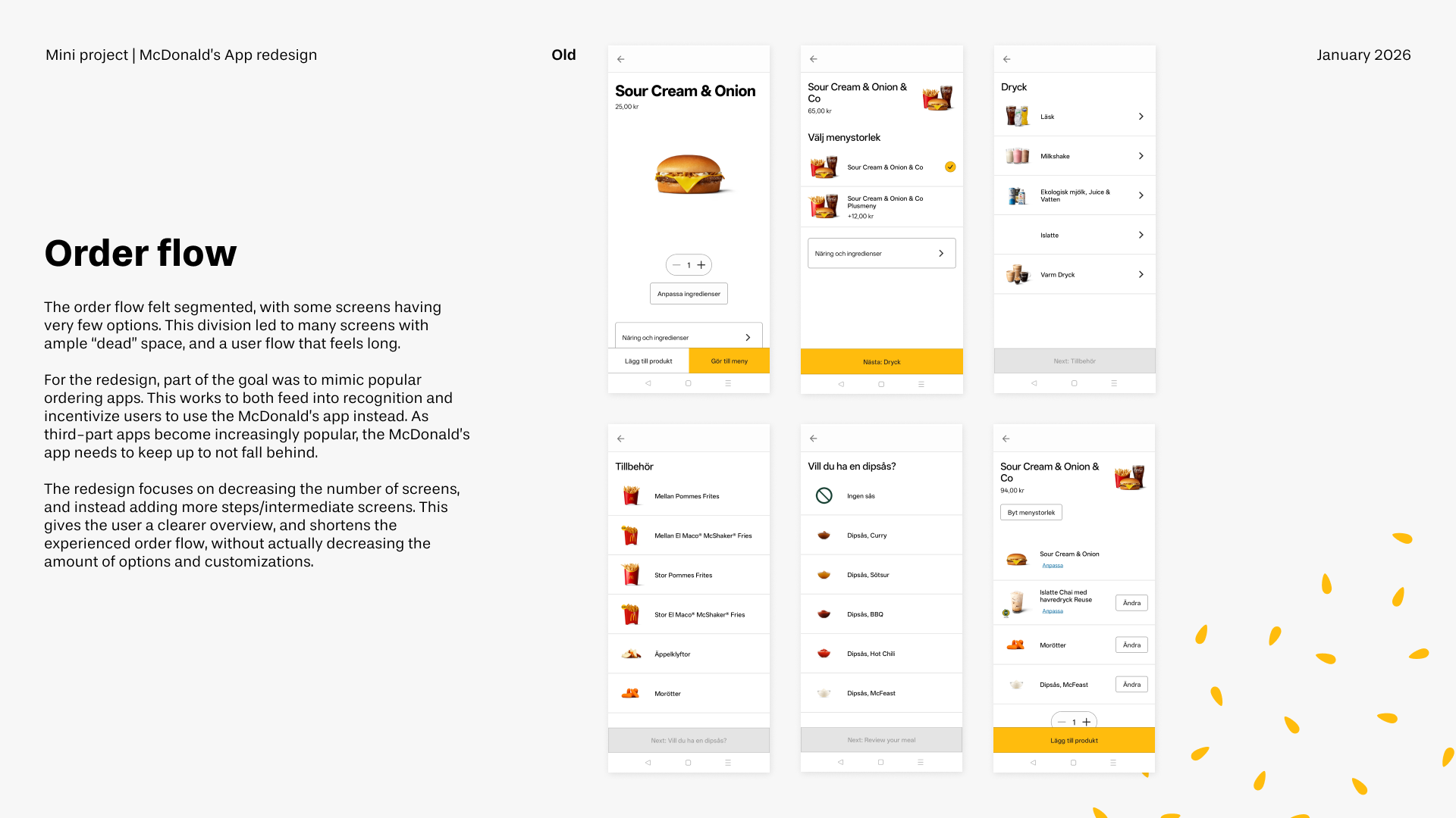
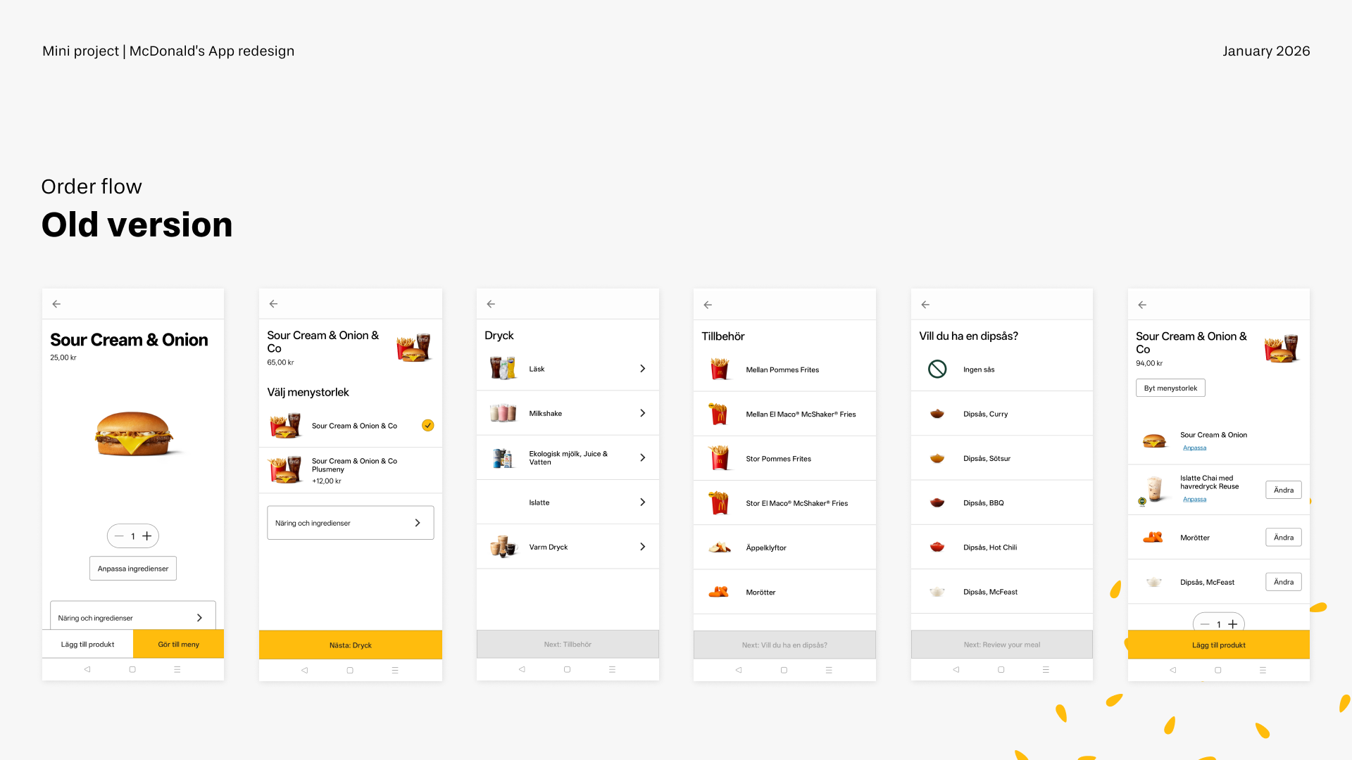
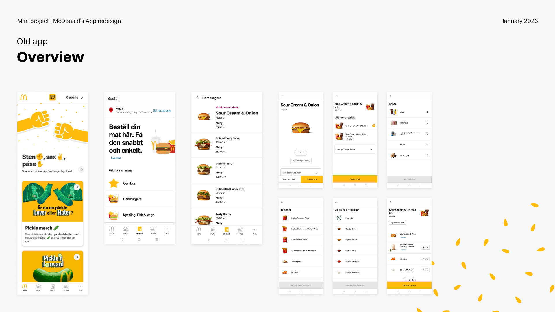
The current app experience feels visually cluttered and inefficient, making simple tasks take longer than necessary. This concept focuses on streamlining key interactions and consolidating steps to achieve fewer screens without losing clarity. By sharpening visual hierarchy and reducing noise, the redesign aims to make the experience faster to scan, easier to understand, and more intuitive to navigate.
Designed for a broad audience, the project prioritises accessibility through simplicity. Clearer structure, stronger focus, and more intentional use of space help create an experience that feels modern, efficient, and aligned with how people actually use the app; quickly, casually, and often on the go.